Poll: New GT3 RS graphics - Good or Bad?
Subscribe


Quote:
The RS needs to make a statement. The wing is like a street RSR Porsche.
I love it all and feel Porsche knows and knew what it was doing.
My 2 cents before the coming Obama taxes.
Ranger
+1. My sentiments exactly!Originally Posted by GT3Ranger
IMO the GT3RS is suppose to be over the top. The RS is and will be unique. Nothing about this car should be tame or vanilla.The RS needs to make a statement. The wing is like a street RSR Porsche.
I love it all and feel Porsche knows and knew what it was doing.
My 2 cents before the coming Obama taxes.
Ranger


Think it looks great. (In fact I think its almost needed to break up any paint color, considering the overall area covered).
My only comment might be that the GT3RS on the bumpers could be removed and just leave the smaller one on the center tail.
As for the wing.........just like with the ViperAcr, the GT3RS...etc, the ricers themselves look like pure crap and thats how I look at them when I see an wing on their car. I'm pretty sure the Cup cars came first in this one!
They are bad, bad, bad. Shoot the designer.
This picture makes me want to put the MKI RS stickers on, even in red, maybe even with the red lips.. I did not know what the gold would look like when I ordered and I always hated the red, but it is slowly growing on me.

This picture makes me want to put the MKI RS stickers on, even in red, maybe even with the red lips.. I did not know what the gold would look like when I ordered and I always hated the red, but it is slowly growing on me.


The graphics are lame and tasteless. But shame on an RS driver who wastes this automotive artwork on a Starbuck's drive-thru instead of ripping it around Laguna Seca where it belongs. Noone minds fugly graphics in track traffic. Say that 10 times fast.
Quote:
Pretty harsh aren't we.Originally Posted by neuroguru
The graphics are lame and tasteless. But shame on an RS driver who wastes this automotive artwork on a Starbuck's drive-thru instead of ripping it around Laguna Seca where it belongs. Noone minds fugly graphics in track traffic. Say that 10 times fast.
Ranger

Quote:
Originally Posted by GT3Ranger
IMO the GT3RS is suppose to be over the top.
Agreed. The car is supposed to be over the top. Originally Posted by GT3Ranger
IMO the GT3RS is suppose to be over the top.
The stickers on the other hand not so much.
Look at the small GT2RS stickers on the bottom of the doors of the most over the top recent Porsche!! GT2RS decals that's how it is done, let the car speak, not the decals.


Yes, yes, yes!
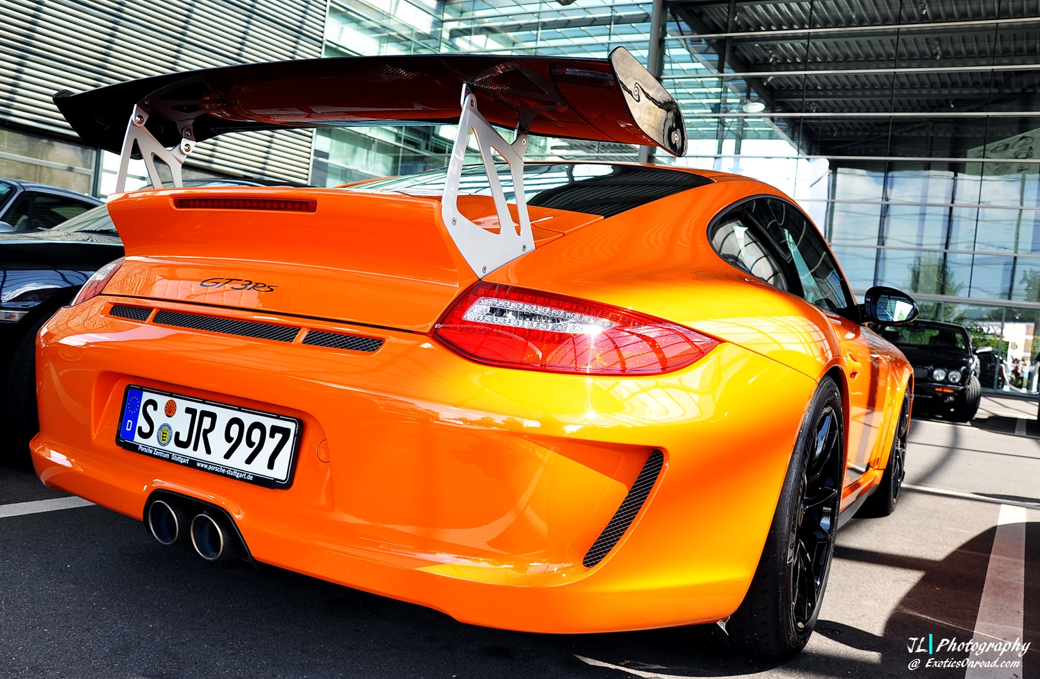
You have to love the orange with black!
If I would be willing to pay for PTS right now I would be torn between the smurf blue, orange and green, black accents decal delete..
You have to love the orange with black!
If I would be willing to pay for PTS right now I would be torn between the smurf blue, orange and green, black accents decal delete..